
We'll use the data (with country name) as an example here.
First fit the model and make an index plot of the residuals:
> savings <- read.table("savings.data") # read the data into R
> g <- lm(sav ~ p15 + p75 + inc + gro, data=savings) # fit the model with sav as the response and the rest variables as predictors
> plot(g$res, ylab="Residual", main="index plot of residuals") # draw the plot of residuals against index
Let's find which countries correspond to the largest and smallest residuals.
> sort(g$res)[c(1,50)] # sort the residuals from small to large and get the largest and smallest residuals; the command "sort" returns a vector in ascending or descending order
Chile Zambia
-8.242284 9.750927
or by using the "identify()" function. We first make up a character vector of the country names using "row.names()" which gets the row names from the data frame.
> countries <- row.names(savings) # extract the country names
>
identify(1:50,g$res,countries) # label the points with their country
names

Leverage
Now let us look at the leverage.
We first extract the X-matrix here using "model.matrix()" and then compute and plot the leverages (also called "hat" values)
> x <- model.matrix(g) # extract X-matrix
> lev <- hat(x) #
calculate leverages. The command "hat" returns the leverage, another way is to use the function
"lm.influence", e.g., lev <- lm.influence(g)$hat, see example in
influential observation
>
sum(lev) # examine the sum of leverages
[1] 5
Why is the sum of the leverages equal to 5? (Hint: how many parameters in β?)
Let's check which countries have large leverages.
We can mark a horizontal line at 2p/n to indicate our "rule of thumb".
> plot(lev, ylab="Leverages",main="index plot of
leverages") # draw the plot of leverages against
index
> abline(h=2*5/50) # add a 2p/n horizontal line

> names(lev) <- countries # use the command "names" to assign the
country names to the elements of the vector lev
>
lev[lev>2*5/50] #
identify the four countries with the largest leverages
Ireland Japan
UnitedStates Libya
0.2122362
0.2233127 0.3336981 0.5314551
You can also identify large leverage from the plot by:
> identify(1:50, lev, countries)
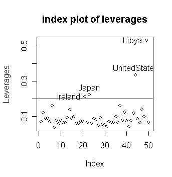
Notice that
large residuals and large leverage are distinct properties
in this case, the sets of countries having such large values do not intersect.
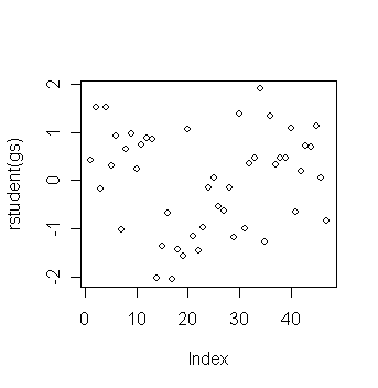
Studentized residuals
Now get the studentized residuals:
> gsum <- summary(g)
# get the summary output of the fitted
model g
> gsum$sig
# The
σ-hat
[1] 3.802648
> stud <-
g$res/(gsum$sig*sqrt(1-lev))
# studentized residuals, an easy way is to use
the function "rstandard()", e.g., stud <- rstandard(g)
>
plot(stud,ylab="studentized Residuals",main="studentized residuals")
# draw the plot of studentized residuals against index

Note the range on the y-axis. How does this compare to the plain residuals?
Which studentized residuals are large?
In this case, there is not much difference between the studentized and raw residuals apart from the scale. Why? Let's take a look of the distribution of sqrt(1-hi):
> stem(sqrt(1-lev)) # draw stem plot of sqrt(1-hi)
The decimal point is 1 digit(s) to the left of the |
6 | 8
7 |
7 |
8 | 2
8 | 89
9 | 2233444
9 | 555555666666666666667777777777777778888
Let's compute the jacknife residuals:
> jack <- stud*sqrt((50-5-1)/(50-5-stud^2))
# jacknife residuals, an easy way is to use the function "rstudent()", e.g.,
jack <- rstudent(g)
> plot(jack, ylab="Jacknife residuals",
main="Jacknife residuals")
# draw the plot of jacknife residuals
against index

Is there much difference between the Jacknife and the studentized or raw residuals? Explain why.
> jack[abs(jack)==max(abs(jack))] # find out the country with largest jacknife residual
Zambia
2.853581
> qt(0.05/2, 44) # compare with tn-p-1(a/2)
[1] -2.015368
The largest residual of 2.85 is pretty big for a standard t-test scale
but is it an outlier under the Bonferroni critical value that takes into consideration the condition of multiple testing?
> qt(.05/(50*2), 44) # compare with tn-p-1(a/2n)
[1] -3.525801
What do you conclude? No outliers are indicated.
Here is an example of a dataset with multiple outliers.
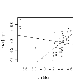
data are available on the log of the surface temperature and the log of the light intensity of 47 stars in the star cluster CYG OB1, which is in the direction of Cygnus.
Read in and plot the data:
> star <- read.table("star.data",h=T) # read the data into R
> star # take a look of the data
index temp light
1 1 4.37 5.23
2 2 4.56 5.74
...deleted...
47 47 4.42 4.50
> plot(star$temp,star$light) # draw the scatter plot of log light intensity against temperature
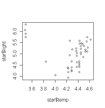
What do you think the relationship is between temperature and light intensity?
Now fit a linear regression and add the fitted line to the plot:
> gs <- lm(light ~ temp, data=star) # fit a model with light as the
response and temp as the predictor
>
abline(gs) # add the fitted
line to the scatter plot
Is this what you expected? Are there any outliers in the data?
Perform the outlier test.
> plot(rstudent(gs)) # plot of jacknife residuals
> sort(rstudent(gs))[c(1,2,3,45,46,47)] # get the three largest and three smallest jacknife residuals
17
14
19
2
4 34
-2.049393 -2.035329 -1.575505
1.522185 1.522185 1.905847
> qt(0.05/2,44); qt(0.05/(2*47),44) # critical value under significance level a/2 and a/2n
[1]
-2.015368
[1] -3.504708
The outlier test does not reveal any.
Let's try to find where the observations with large jacknife residuals located:
> star$temp[c(17,14,19,2,4,34)] # get the temp values of the six observations with most extreme jacknife residuals
[1] 4.23 4.01 4.23 4.56 4.56 3.49
The four stars on the upper left of the plot are giants. See what happens if these are excluded:
> gs1 <- lm(light ~ temp, data=star,
subset=(temp>3.6)) # fit a model without using the giant
data
> plot(star$temp,star$light); abline(gs); abline(gs1, lty=2)
# add the fitted line of the last
fitted model
Examine the regression summary and compare to the previous one. (exercise)
This example illustrates the problem of multiple outliers.
We can visualize the problems here, but for higher dimensional data, this is much more difficult.
Continuing with our study of the saving data. First we compute and plot the Cook statistics:
> cook <- stud^2*lev/(5*(1-lev)) # The Cook
statistics, an easy way is to use the function "cooks.distance()", e.g., cook
<- cooks.distance(g)
> plot(cook, ylab="Cooks distance") # draw the plot of Cook's statistics
against index
>
identify(1:50,cook,countries)
# identify the three countries with largest Cook's statistics\
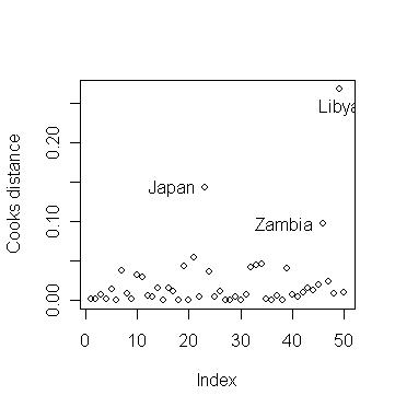
Why do the three countries have largest Cook's statistics?
We now exclude Libya and see how the fit changes:
> g1 <- lm(sav ~ p15+p75+inc+gro,subset=(cook <
0.2),data=savings) # fit a model without Libya data
>
summary(g1) # take a look of the fitted model
without Libya data
Coefficients:
Value Std. Error t value Pr(>|t|)
(Intercept)
24.5247 8.2240 2.9821
0.0047
p15
-0.3915 0.1579 -2.4790
0.0171
p75
-1.2810 1.1452 -1.1186
0.2694
inc
-0.0003 0.0009 -0.3430
0.7332
gro
0.6103 0.2688 2.2706 0.0281
Residual standard error: 3.795 on 44 degrees of freedom
Multiple
R-Squared: 0.3554
F-statistic: 6.066 on 4 and 44 degrees of freedom, the
p-value is 0.0005616
Compared to the full data fit:
> summary(g) # take a look of the fitted model with all data
Coefficients:
Value Std. Error t value Pr(>|t|)
(Intercept)
28.5666 7.3545 3.8842
0.0003
p15
-0.4612 0.1446 -3.1886
0.0026
p75
-1.6916 1.0836 -1.5611
0.1255
inc
-0.0003 0.0009 -0.3617
0.7193
gro
0.4097 0.1962 2.0882 0.0425
Residual standard error: 3.803 on 45 degrees of freedom
Multiple
R-Squared: 0.3385
F-statistic: 5.756 on 4 and 45 degrees of freedom, the
p-value is 0.0007902
What changed?
Excluding Libya did have a moderate effect on the quantitative values of the coefficients.
The coefficient for gro changed by about 50%.
We don't like our estimates to be so sensitive to the presence of just one country.
It would be rather tedious to do this for each country. There's is a quick way in R so that we don't have to fit 50 regression models to examine the coefficients found when each country is excluded:
> ginf <- lm.influence(g) # calculate some values
useful for investigating influence
> names(ginf) # ginf has three
components, the hat values (leverages), change in leave-out-one coefficients,
change in leave-out-one sigmahat, and weighted residuals
[1] "hat" "coefficients" "sigma" "wt.res"
> ginf # take a look of ginf
$hat
Australia Austria Belgium Bolivia Brazil Canada
0.06771409 0.12039224 0.08748097 0.08947314 0.06956000 0.15840654
...deleted...
Libya Malaysia
0.53145507 0.06523377
$coefficients
(Intercept) p15 p75 inc gro
Australia 0.09156168 -1.525349e-03 -0.029047707 4.265293e-05 -3.166120e-05
Austria -0.07467639 8.682630e-04 0.044733545 -3.456376e-05 -1.622880e-03
...deleted...
Malaysia 0.27201243 -8.876680e-03 0.035190516 -4.633154e-05 -1.423981e-02
$sigma
Australia Austria Belgium Bolivia Brazil Canada
3.843255 3.844341 3.829643 3.844035 3.805321 3.845264
...deleted...
Libya Malaysia
3.794791 3.817615
$wt.res
Australia Austria Belgium Bolivia Brazil Canada
0.8632876 0.6162526 2.2187481 -0.6982426 3.5527272 -0.3172475
...deleted...
Libya Malaysia
-2.8294673 -2.9708394
Let's plot the change in the second (p15) and third (p75) parameter estimates when a case is left out. (Try this for the other estimates).
> plot(ginf$coef[,2],ginf$coef[,3],xlab="change in p15 coef", ylab="change in p75 coef") # draw the plot of "changes in p15" against "changes in p75"
> identify(ginf$coef[,2],ginf$coef[,3],countries) # identify the countries whose data cause larger changes in parameter estimation

Which countries stick out?
Consider a fit without Japan:
> gj <- lm(sav ~ p15+p75+inc+gro,subset=(countries
!= "Japan")) # fit a model without Japan data
>
summary(gj) # take a look of the fitted model
Coefficients:
Value Std. Error t value Pr(>|t|)
(Intercept)
23.9408 7.7840 3.0756
0.0036
p15
-0.3679 0.1536 -2.3948
0.0210
p75
-0.9738 1.1554 -0.8428
0.4039
inc
-0.0005 0.0009 -0.5119
0.6113
gro
0.3348 0.1984 1.6869 0.0987
Residual standard error: 3.738 on 44 degrees of freedom
Multiple
R-Squared: 0.277
F-statistic: 4.214 on 4 and 44 degrees of freedom, the
p-value is 0.005648
Compare it to the full data fit - what qualitative changes do you observe?
Finally, let's try to identify the countries that are influential on individual coefficient estimates and sigmahat.
> par(mfrow=c(2,3)) # split the graph window into 2x3 subwindows
> plot(ginf$coef[,2]);abline(h=0);identify(1:50,ginf$coef[,2],countries) # p15
> plot(ginf$coef[,3]);abline(h=0);identify(1:50,ginf$coef[,3],countries) # p75
> plot(ginf$coef[,4]);abline(h=0);identify(1:50,ginf$coef[,4],countries) # inc
> plot(ginf$coef[,5]);abline(h=0);identify(1:50,ginf$coef[,5],countries) # gro
> plot(ginf$sig);identify(1:50,ginf$sig,countries) # σ-hat
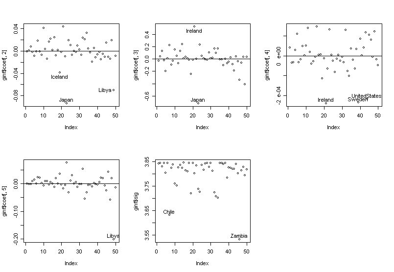
We can see the influence is not simple --- countries have influence on different components of the fit.
The following is a summary of the countries we identified in previous analysis.
| Zambia | Chile | Libya | US | Japan | Ireland | Sweden | |
| large leverage | ** | * | * | * | |||
| studentized residual | * | * | |||||
| jacknife residual | * | * | |||||
| Cook stat. | * | ** | * | ||||
| diff. in LO1 coef. (p15) | * | * | |||||
| diff. in LO1 coef. (p75) | * | * | |||||
| diff. in LO1 coef. (inc) | * | * | * | ||||
| diff. in LO1 coef. (gro) | * | ||||||
| change in LO1 sigma | * | * |